The idea behind DIGITUS®
As a brand of ASSMANN Electronic GmbH, DIGITUS®was founded in 1994 in Lüdenscheid. The goal from the very beginning was to specifically support trade and provide reliable solutions for professional use. The claim was always pragmatic: technology should provide real benefits in everyday life.
This idea formed the basis for a brand that from the start focused on quality, reliability, and user-friendliness. DIGITUS® aimed to create products that meet professional requirements and effectively support trade – an approach that continues to shape the core of the brand to this day.


From this approach..
..DIGITUS® continuously evolved. With a growing portfolio and increasing internationalization, the brand established itself as a provider of standardized connection, network, and accessory solutions. Growth occurred through consistency, market proximity, and long-term applicability.
Today, DIGITUS® stands for high-performance solutions for structured building cabling as well as for the intelligent networking of modern work environments. The portfolio ranges from network technology to AV media technology to peripheral products.
Trusted connections since 1994 – this is not only our claim but our promise: DIGITUS® connects technology, trade, and users in a way that creates trust and lasts.
DIGITUS® Relaunch explained by the CEO
The relaunch of our DIGITUS® brand marks the beginning of a new chapter in our company's development. In this video, our CEO explains the background, goals, and vision behind the new brand identity. Under the claim "Trusted connections since 1994", DIGITUS® demonstrates what the brand has stood for for over 30 years: reliable, secure, and future-oriented IT solutions together with customers and partners. The relaunch goes far beyond design and focuses on our four core product areas. Find out in the video what role trust, innovation, and partnership play for DIGITUS®.
1994
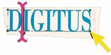
The first DIGITUS® logo combines a playful typeface with graphic elements such as an arrow and mouse pointer. It represents a new beginning, movement, and an early connection to the computer world.
2004
The lettering becomes clearer and more strongly framed. The frame gives the brand greater stability and structure – a first step toward a more professional appearance.
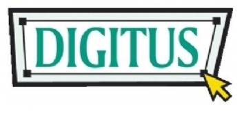
2009
The logo is further reduced. The outer frame recedes, and the wordmark gains presence. The trademark symbol is integrated for the first time.
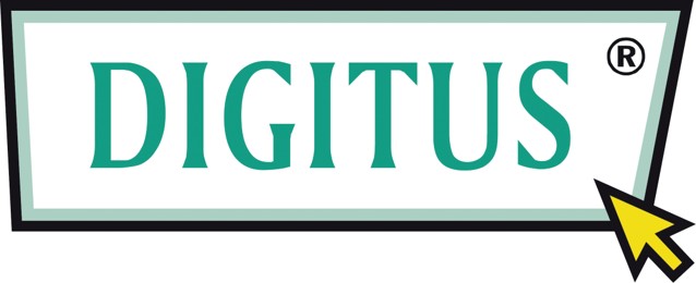
2009

Fine-tuning of the visual language: clear lines, reduced colors, and a stronger focus on the brand name itself.
2013
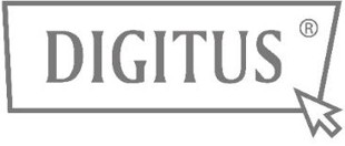
The logo appears more subtle and neutral. Shades of gray and reduced contrasts emphasize the brand’s objective, professional character.
2015

Clear black-and-white wordmark. The design is timeless, confident, and internationally applicable – optimized for digital and analog use.
2026
The four tiles in the current logo represent the core business areas of DIGITUS®: networking technology, network and server cabinets, AV media technology, as well as cables and peripherals. The extended “t” in the lettering highlights DIGITUS®’s ambition to always stay one step ahead.